Not Taking The Parts For Granted
I always like to chat about the necessary parts of buildings that we sometimes take for granted. Even the most benign functional things can play an essential role in the feel, texture, and style of a place. One of the most useful of these things is architectural screens, fences, and lattice. Screens and fences are used for privacy or as a visual or physical boundary. Lattice is another such barrier that is supposed to block the view and access to critters from under your porch while still allowing air to flow. There are so many choices we make as architects to design them, so they disappear to blend into the surroundings or play a starring role. These fences play an important roll in setting the tone for two very different aesthetics.
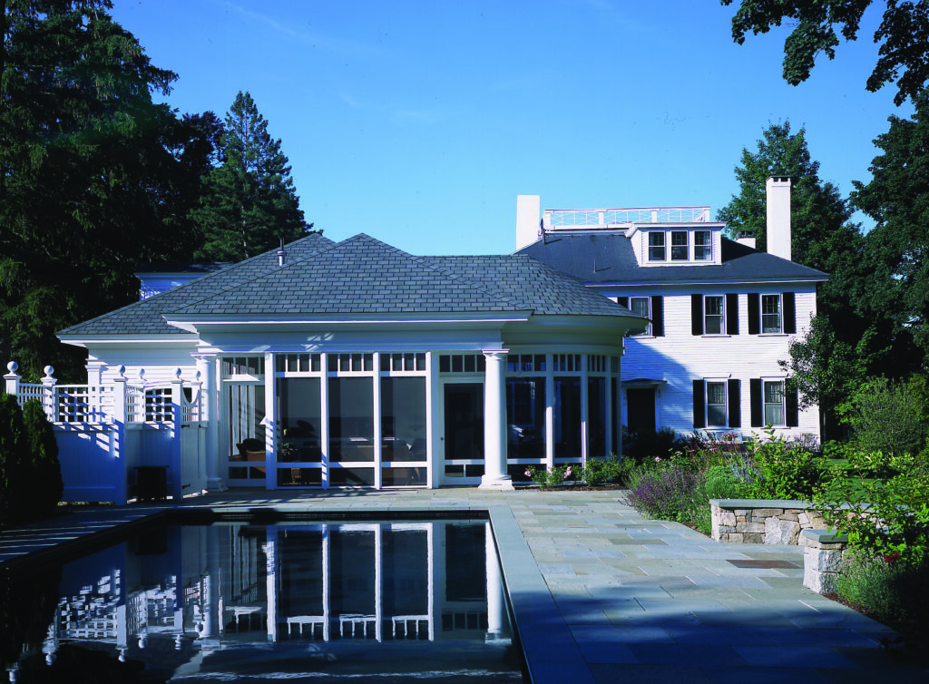
Here the traditional white fence blends with the lacy attitude of the screen porch while doing its job to provide privacy to the pool area and a barrier that is required by code.
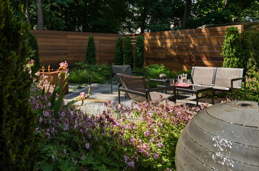
The modern wooden fence provides privacy for an in-town contemporary garden, and boldly states that you will see lots of clean, modern things as you enter this remodeled home.
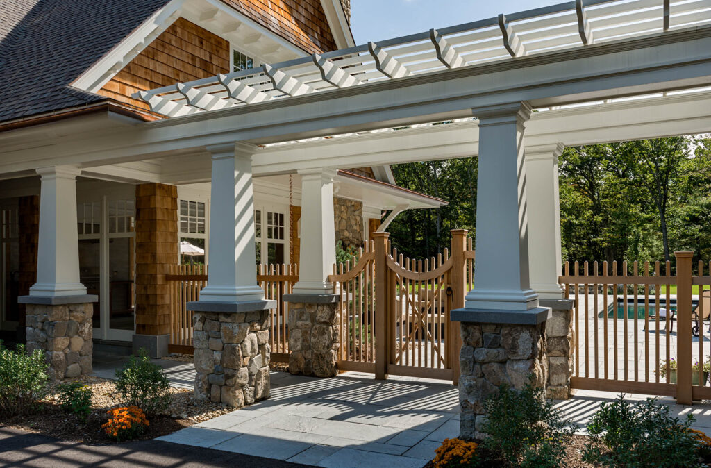
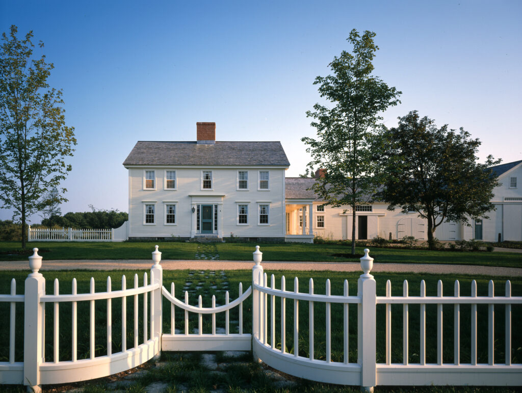
These traditional fences set up a layering effect as you move from public to private areas. They interact well with the architecture.
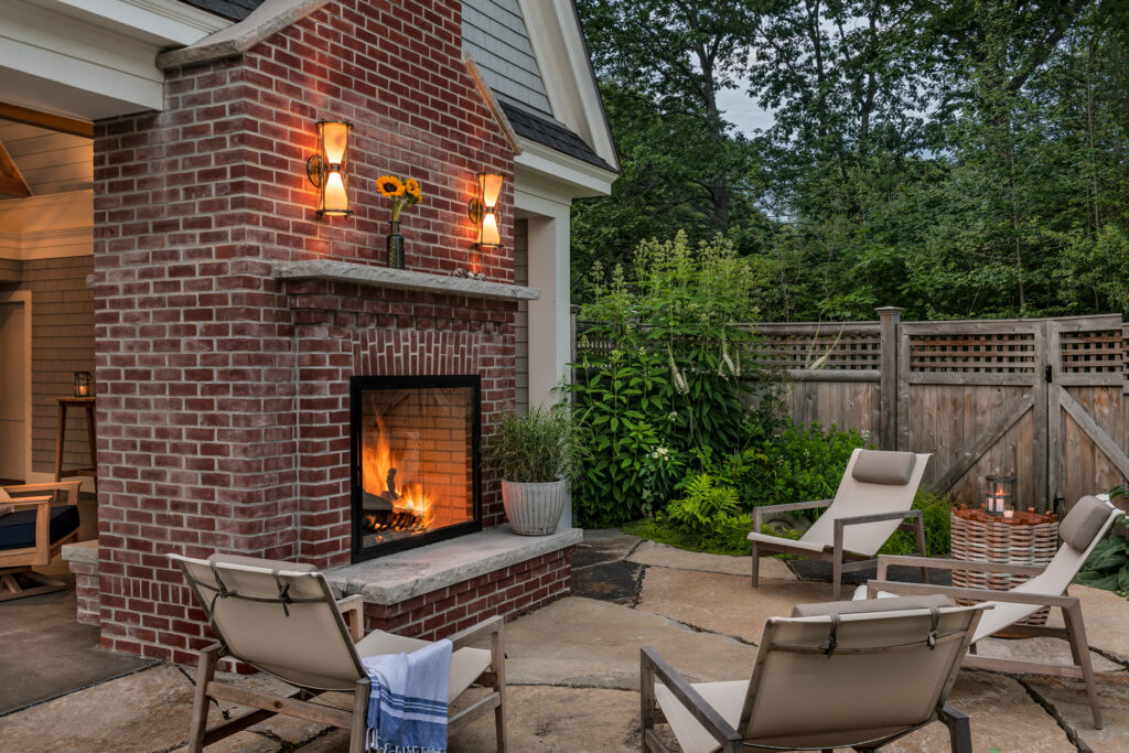
This fence has nothing in common with the architecture and therefore sets up a casual backdrop for this poolside fireplace.
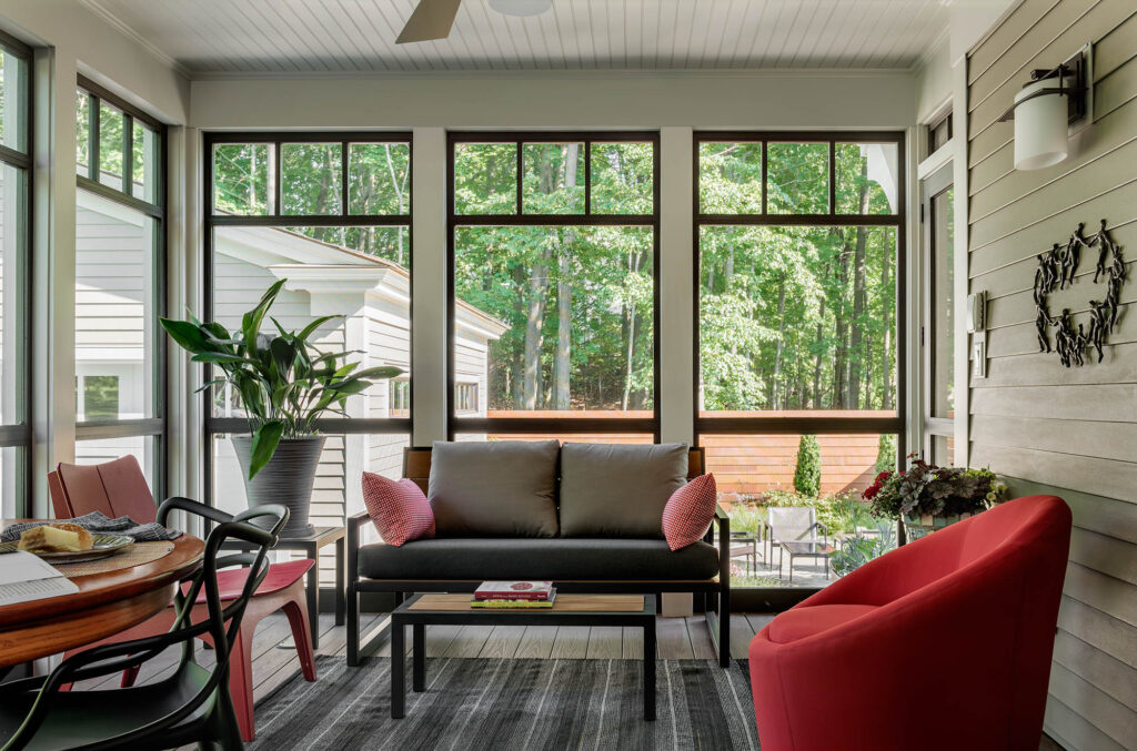
This sunroom takes on the language of an open porch. The use of a lattice screen, with an oval cutout that mimics some of the home’s window details, gives some enclosure and shade to the space while adding a traditional element.
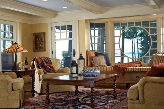
Similarly, this bench greets you at the entry porch and is framed by a round screen cutout that is repeated in the living room where it frames the view to the mountains. One could argue without these details, this renovation would still work, but the repetition of language and events ties the home together.
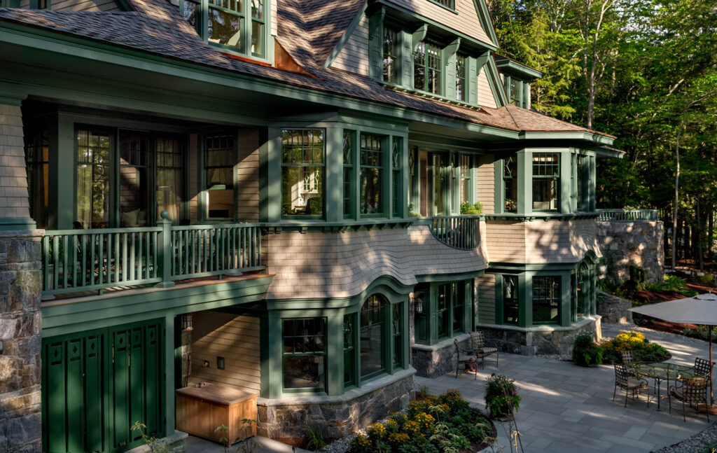
The functional exterior screen at the basement level of this home blocks an exterior storage area from view while still allowing air to flow under the deck above. Again the diamond cutouts follow the diamond motif throughout the house, including the diamond muntins you see in the adjacent windows.
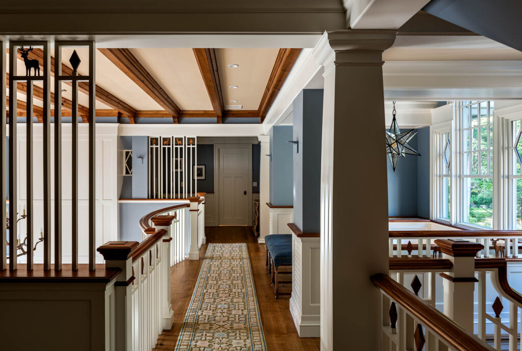
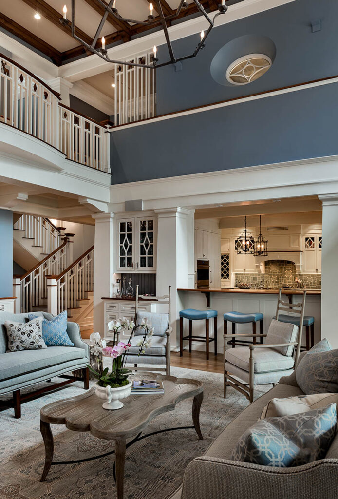
Reinterpreted, on the interior of this same home, the screen gives some separation to the balcony study areas on either side of the two-story living room.
It also defines the boundary of the living room and gives this 20′ high volume some interest and sense of scale.
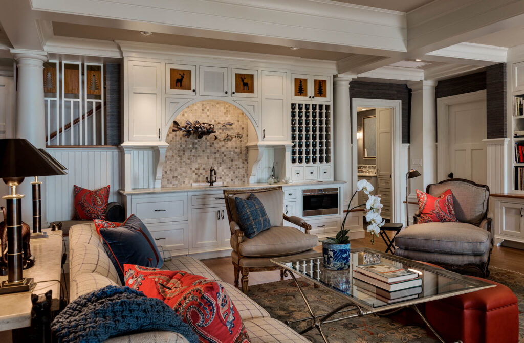
In the basement, these motifs are used a little more playfully in the upper guard rail (screen) at the stair. This type of reinterpretation allows the stair to be open but still part of the overall composition of cabinets and built-ins on this family room kitchenette wall.
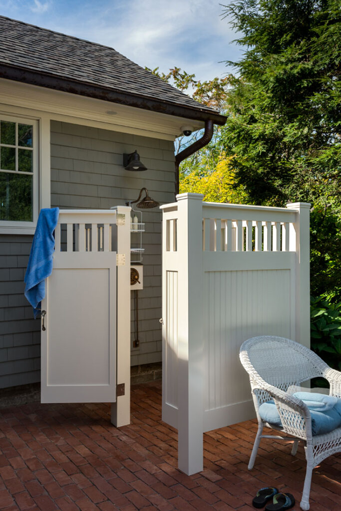
This outdoor shower, surrounded by a very straightforward fencing system, works well with the home’s details.
Alternatively, in a home with a very small back yard and some close adjacency to the neighbors, another approach was used. Each side of this porch was filled in with a custom screen that gives privacy to an outdoor shower on one side and buffers the neighbors that are 15′ away on the other. The height of the interior transom windows is reflected in a screen change from full privacy at the bottom to open balusters at the top. This was a creative way to integrate the architecture with the functional, needed privacy screens.
This home uses a simple vertical board pattern as the barrier under its porches. The architect could have used any number of lattice configurations to do the same functional job. However, it was a great decision to use simplicity here as to not take away from the intricate railings that are being highlighted on the porches and decks above. Had the railings been simple, the choice for cutouts in the vertical boards or some more complex patterns could have been deployed.
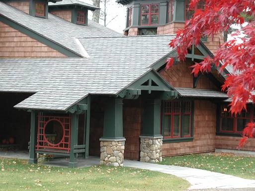
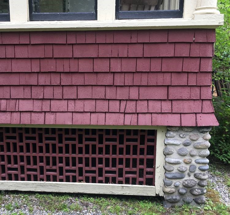
Here is an example of a historic home’s lattice where this complexity is celebrated amongst the simple forms of the foundation and simple porches. Certainly an inspiring design for this classic arts and crafts home.
Hopefully, the next time you look at a home, you may be more aware of some of the pieces and begin to realize why some things are appealing and why some items are not as pleasing. There is a vast vocabulary to work with when building a home, and we hope that we make wise choices for all the pieces and parts so that the building flows together in a pleasing composition you can call home. If you’ve been looking to add some new aesthetic details to your home don’t hesitate to contact us today.

