Take a Look at Pantone’s 2015 Color Palettes
If you’re thinking about painting your home, or want to accent a specific architectural feature, you’ve probably started thinking about the colors you might like to use. However, color selection is more complicated than just picking one hue. You should choose colors that complement each other harmoniously or create an interesting contrast, depending on your style and preference.
If you’re not sure what to do, why not check out the nine new color palettes just released by the color forecasting firm Pantone for inspiration? Take a look below to see which colors are expected to be favored in home design over the next year, as well as a few example of some similar hues in past projects by TMS Architects.
Style-Settings
This color palette comes straight from the runway, showcasing the poise and finesse of the fashion world. Purple is paired with classic grays, taupes and mahoganies to create an elegant, modern feel.
Abstractions
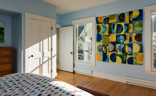
The world of abstract art is captured by this color palette, which blends hues, such as stonewashed blue, dark red, bright purple, apricot and hazelnut brown. This mosaic of colors translates as a fine work of art and is a good choice if you’re looking for something eclectic.
Botanicum
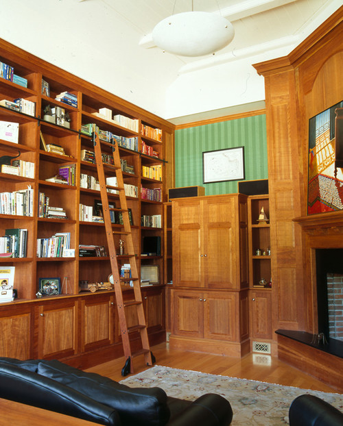
New earth tones are captured in this fresh color palette, featuring bright yellow-green, shades of purple and blue and warm gray and brown for balance. Sticking with natural tones is usually a safe bet for most rooms if you don’t want a very bold look.
Zensations
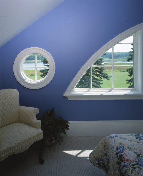
Love blue? Take it to the next level by pairing it with this color palette of silver, gold, purple and soft green.
Urban Jungle
This color palette helps you get in touch with your wild side, bringing together typical and atypical jungle hues, such as warm animal skin tones, deep blue-green, greenish yellow, peach and black and white.
Tinted Medley
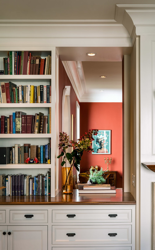
Delight your inner child with a playful combination of warm pinks and peaches. We love the idea of accenting this palette with powdered yellow and rosy taupe.
Past Traces
Vintage style is making a comeback, and color is a great way to pay homage to your favorite decades. Olive green, pastel blue, and pinks — yes, please!
Serendipity
If a bold hue is what you desire, look to this color palette for inspiration. A medium taupe serves as an anchor for the brighter hues here.
Spontaneity
All of us should probably be a little more spontaneous, and you can start by adding some of these fun colors to your room: Kelly Green, Cantaloupe, Marigold and Misty Jade are just a few unexpected, yet exciting colors.
Which of these color palettes do you like the most? Let us know by leaving a comment below.


