Music Hall Lobby
Portsmouth, NH
On October of 2006, the attention moved from The Music Hall’s auditorium to the dark and cramped lobby on the first floor. The first impression patrons received when they entered…
Read More
Read Less
On October of 2006, the attention moved from The Music Hall’s auditorium to the dark and cramped lobby on the first floor. The first impression patrons received when they entered the lobby was cracked flooring tiles, antiquated bathrooms and an outdated box office. During the course of engineering investigations, it was discovered that there were no structural elements standing in the way of enlarging the lobby by excavating underneath the structure itself.
By removing 700 cubic yards of ledge, the size of the lobby was increased from 1,110 square feet to 2,600 square feet. Architect John Merkle remarked that “we’ve had a small mining operation in there”. Crews built barriers to keep the curious at bay, constructed temporary bathrooms and ran air cleaners constantly so that the theatre could remain open.
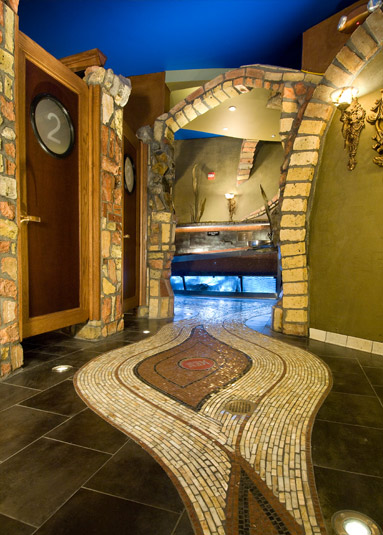
During the formulation of the strategic plan for the lobby renovation, three core concepts were developed; the design would be a harmonious reflection of the theatre’s original period, integrating 21st century technology while preserving echoes of the past in colors, curves and materials; the design would incorporate actual elements that told the story of the history of the building and the third commitment was to make the renovation as sustainable as possible.
The Music Hall’s Executive Director, Patricia Lynch, said “…in a theater you want something magical …so many theaters make mistakes with their lobbies. I didn’t want a bank lobby. I wanted a magical place”.
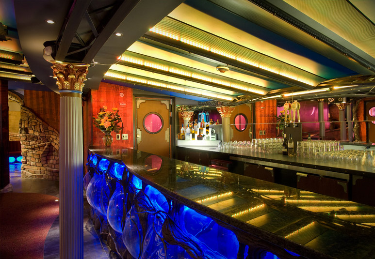
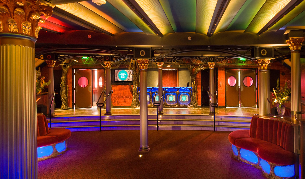
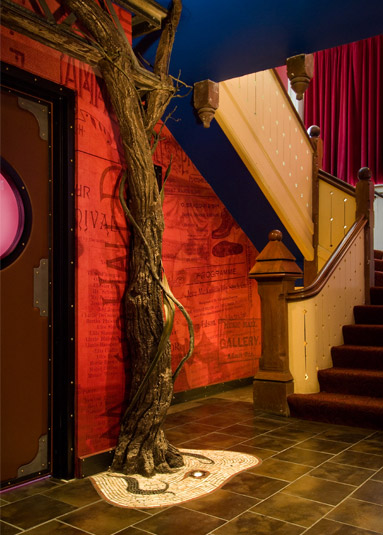
In keeping with this directive, a “fantasy forest” of cast bronze trees, branches and vines, gilded Corinthian columns, elegant velvet settees and a concession stand with handformed illuminated bubbles were installed. The story of The Music Hall is told in the lobby wallpaper by incorporating archival items such as old playbills, ticket stubs, and photographs.
- Cramped lobby space was enlarged from 1,110 square feet to 2,600 square feet by removing 700 cubic yards of ledge
- Theatre remained opened during extensive renovation
- Design incorporates elements of Beaux Arts period in which The Music Hall was built
- Winner of 2008 NH Preservation Alliance Award and 2009 AIANH Merit Award
Download Project Page
On October of 2006, the attention moved from The Music Hall’s auditorium to the dark and cramped lobby on the first floor. The first impression patrons received when they entered the lobby was cracked flooring tiles, antiquated bathrooms and an outdated box office. During the course of engineering investigations, it was discovered that there were no structural elements standing in the way of enlarging the lobby by excavating underneath the structure itself.
By removing 700 cubic yards of ledge, the size of the lobby was increased from 1,110 square feet to 2,600 square feet. Architect John Merkle remarked that “we’ve had a small mining operation in there”. Crews built barriers to keep the curious at bay, constructed temporary bathrooms and ran air cleaners constantly so that the theatre could remain open.
During the formulation of the strategic plan for the lobby renovation, three core concepts were developed; the design would be a harmonious reflection of the theatre’s original period, integrating 21st century technology while preserving echoes of the past in colors, curves and materials; the design would incorporate actual elements that told the story of the history of the building and the third commitment was to make the renovation as sustainable as possible.
The Music Hall’s Executive Director, Patricia Lynch, said “…in a theater you want something magical …so many theaters make mistakes with their lobbies. I didn’t want a bank lobby. I wanted a magical place”.
In keeping with this directive, a “fantasy forest” of cast bronze trees, branches and vines, gilded Corinthian columns, elegant velvet settees and a concession stand with handformed illuminated bubbles were installed. The story of The Music Hall is told in the lobby wallpaper by incorporating archival items such as old playbills, ticket stubs, and photographs.


