Provident Bank Seabrook
Seabrook, NH
The challenge was to create a consistent unified architectural theme for a variety of branch bank options for The Provident Banks’ expansion, including existing storefronts, existing free-standing buildings and new…
Read More
Read Less
The challenge was to create a consistent unified architectural theme for a variety of branch bank options for The Provident Banks’ expansion, including existing storefronts, existing free-standing buildings and new stand-along structures. The Provident Banks’ emphasis is on superior customer service; therefore, it was incumbent that the design solution should be non-institutional in character and evoke a more residential and personal ambiance.
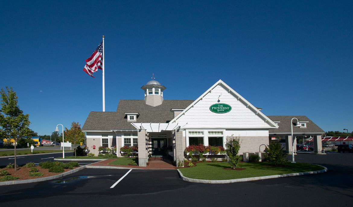
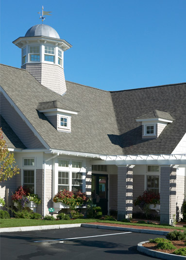
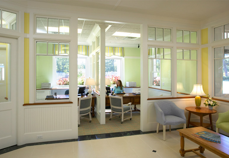
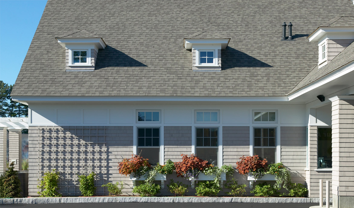
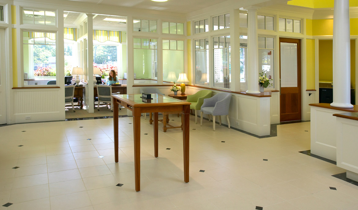
Being located along the coast of New England, it was natural to draw form the region’s rich historic architectural heritage for a design theme. Gable and hip roofs with richly appointed details such as arbors, brackets, lattice, window boxes, shutters, small-paned windows, columns, bead board and brick sidewalks became our architectural palette. Generous use of exterior and interior windows fills the interior spaces with an abundance of natural light. The consistent use of white wood trim, mahogany highlights, yellow and green wall colors are complimented by furnishings that are decidedly more residential than institutional in feel. The overall result successfully reinforces the bank’s customer-oriented philosophy while creating an environment in which employees and customers thrive.
One of the more interesting design elements in the banks was the design of the teller lines which have been created in a zig zag pattern. Because of this configuration, customers are not standing next to each other which creates a sense of personal space and privacy. Lighting was carefully considered as well; a bright, airy feel with few shadows is a commonality in all branches.
The exterior layout is critical to the success of the project as well. The bank needs to be visible to customers but not blocked by a large parking lot. Therefore, the parking areas are broken up into five or six car parking areas with landscaping or stone walls to create a more residential feel. The drive-through lines and ATM equipment are situated behind the bank so that the appearance of the branch storefront is not dominated by vehicular traffic.
According to a senior vice president for retail banking at The Provident, “they (the architects) give our branches a human personality. We need to establish an emotional link with the customer.” It is important, too, that each branch bank integrate seamlessly into the community in which they are located and are respectful of the unique character of the city or town in which they are built.
- Locations: Storey Street, Newburyport, MA (formerly a Friendly’s Restaurant)
- Downtown Newburyport, MA (an existing storefront location)
- Seabrook, NH (a new standalone structure)
- Downtown Portsmouth, NH (an existing storefront location)
- Amesbury, MA (a renovation)
- Exeter, NH (a new standalone structure)
- Objective was to create a unified architectural these for s variety of branch bank options that was non-institutional in character
Download Project Page
The challenge was to create a consistent unified architectural theme for a variety of branch bank options for The Provident Banks’ expansion, including existing storefronts, existing free-standing buildings and new stand-along structures. The Provident Banks’ emphasis is on superior customer service; therefore, it was incumbent that the design solution should be non-institutional in character and evoke a more residential and personal ambiance.
Being located along the coast of New England, it was natural to draw form the region’s rich historic architectural heritage for a design theme. Gable and hip roofs with richly appointed details such as arbors, brackets, lattice, window boxes, shutters, small-paned windows, columns, bead board and brick sidewalks became our architectural palette. Generous use of exterior and interior windows fills the interior spaces with an abundance of natural light. The consistent use of white wood trim, mahogany highlights, yellow and green wall colors are complimented by furnishings that are decidedly more residential than institutional in feel. The overall result successfully reinforces the bank’s customer-oriented philosophy while creating an environment in which employees and customers thrive.
One of the more interesting design elements in the banks was the design of the teller lines which have been created in a zig zag pattern. Because of this configuration, customers are not standing next to each other which creates a sense of personal space and privacy. Lighting was carefully considered as well; a bright, airy feel with few shadows is a commonality in all branches.
The exterior layout is critical to the success of the project as well. The bank needs to be visible to customers but not blocked by a large parking lot. Therefore, the parking areas are broken up into five or six car parking areas with landscaping or stone walls to create a more residential feel. The drive-through lines and ATM equipment are situated behind the bank so that the appearance of the branch storefront is not dominated by vehicular traffic.
According to a senior vice president for retail banking at The Provident, “they (the architects) give our branches a human personality. We need to establish an emotional link with the customer.” It is important, too, that each branch bank integrate seamlessly into the community in which they are located and are respectful of the unique character of the city or town in which they are built.

